GitLab Onboarding
Designing a Sibling Navigator to help new users understand GitLab hierarchy while onboarding.
Timeline
Spring 2026
Role
UX Designer
Skills
User Interview
Usability Testing
Design Systems
Team
2 User Researchers
2 UX Designer (me)
Our Client

GitLab is a web-based DevOps platform that helps teams build, manage, and deliver software all in one place. The goal of this project is to understand the pain points of software engineers during onboarding and identify the biggest roadblocks they face in the early stages of using the platform, in order to improve the efficiency and confidence of new users.
--
User Research
8 initial user interviews to uncover pain points
Previous research done by GitLab user researchers has revealed multiple usability issue that impact the early stage user adoption of the platform. Our research goal is to pinpoint at the high impact usability issue and validate the problem.
Method
As a team, we ran 8 moderated user interviews with participants recruited through a screener. We targeted software developers, as they are the largest user group for GitLab, and selected participants who had never used GitLab or were unfamiliar with it (fewer than three months of experience).
Each session consisted of three parts:
Pre-session questions to understand participants’ backgrounds, how they typically onboard new tools, and the technical tools they use in their daily workflows
Free exploration of the simulated environment
Task analysis to understand how participants navigate and complete key actions
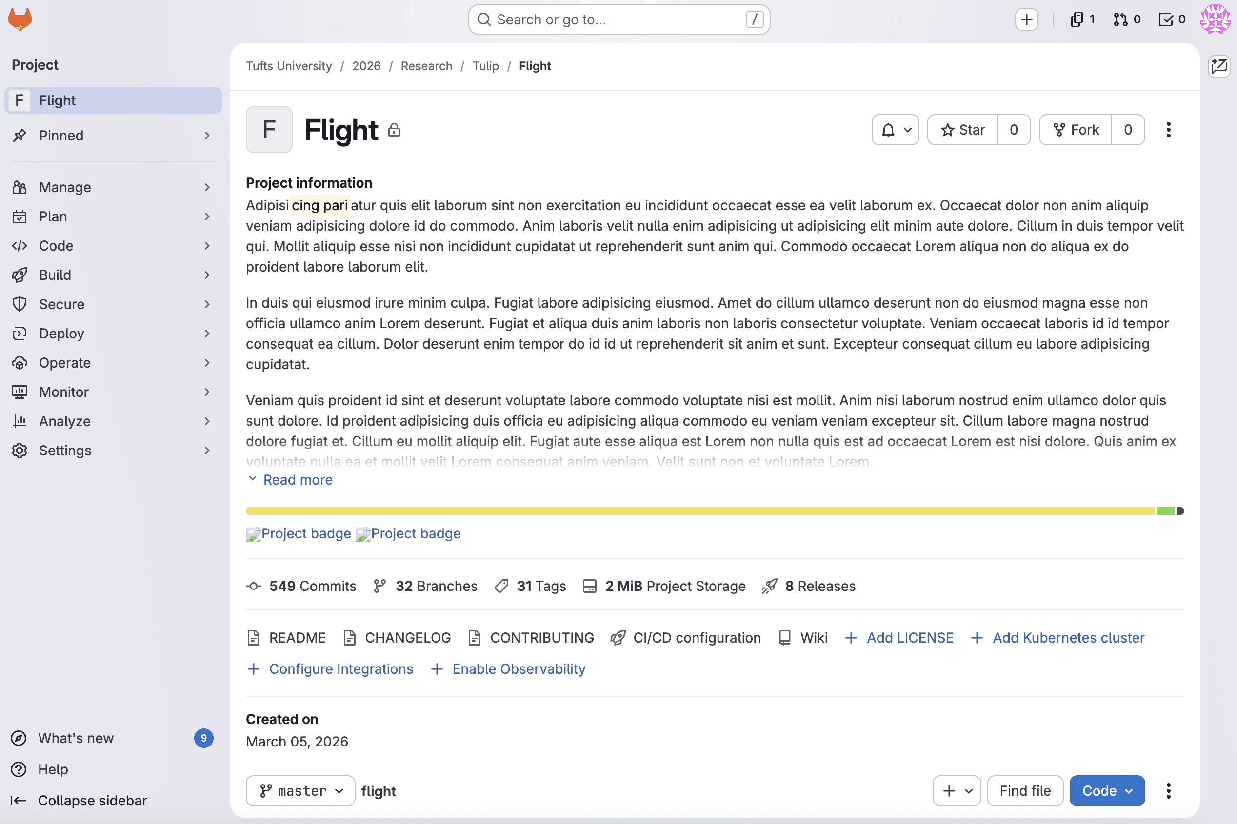
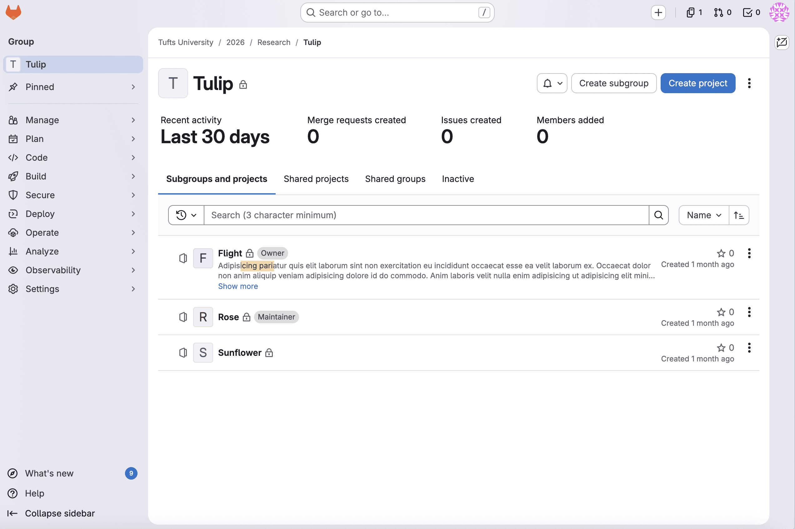
We set up a simulated GitLab environment using imported public projects.
Consolidating our discovery through affinity mapping
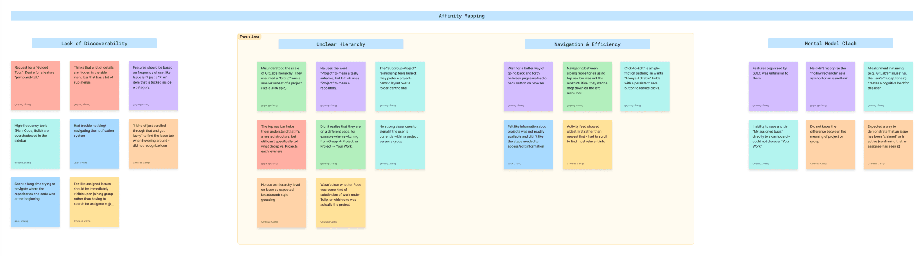
Our affinity map revealed 4 clusters of pain points
🎯
Lack of Discoverability
People felt that high-frequency tools are buried in deep sub-menus, and navigation often relies on accidental discovery rather than intuitive design.
🎯
Unclear Hierarchy
People struggled to understand GitLab’s hierarchy / structure because they are confused by the terminology of “Group” and “Project” and there is no clear visual cue to distinguish them.
🎯
Navigation & Efficiency
People found current workflows high-friction due to a reliance on browser back buttons and “click tax”.
🎯
Mental Model Clash
People with backgrounds in GitHub or other tools experience a mental model clash when transitioning to GitLab.
Then, we framed design opportunities through defining How Might We statements
🎯 We prioritized usability issues around hierarchy and navigation due to impact and severity.
How Might We #1
increase user confidence in identifying which hierarchy/page they are in (even in misclicks)
How Might We #2
make users understand the GitLab organization/structure at a glance
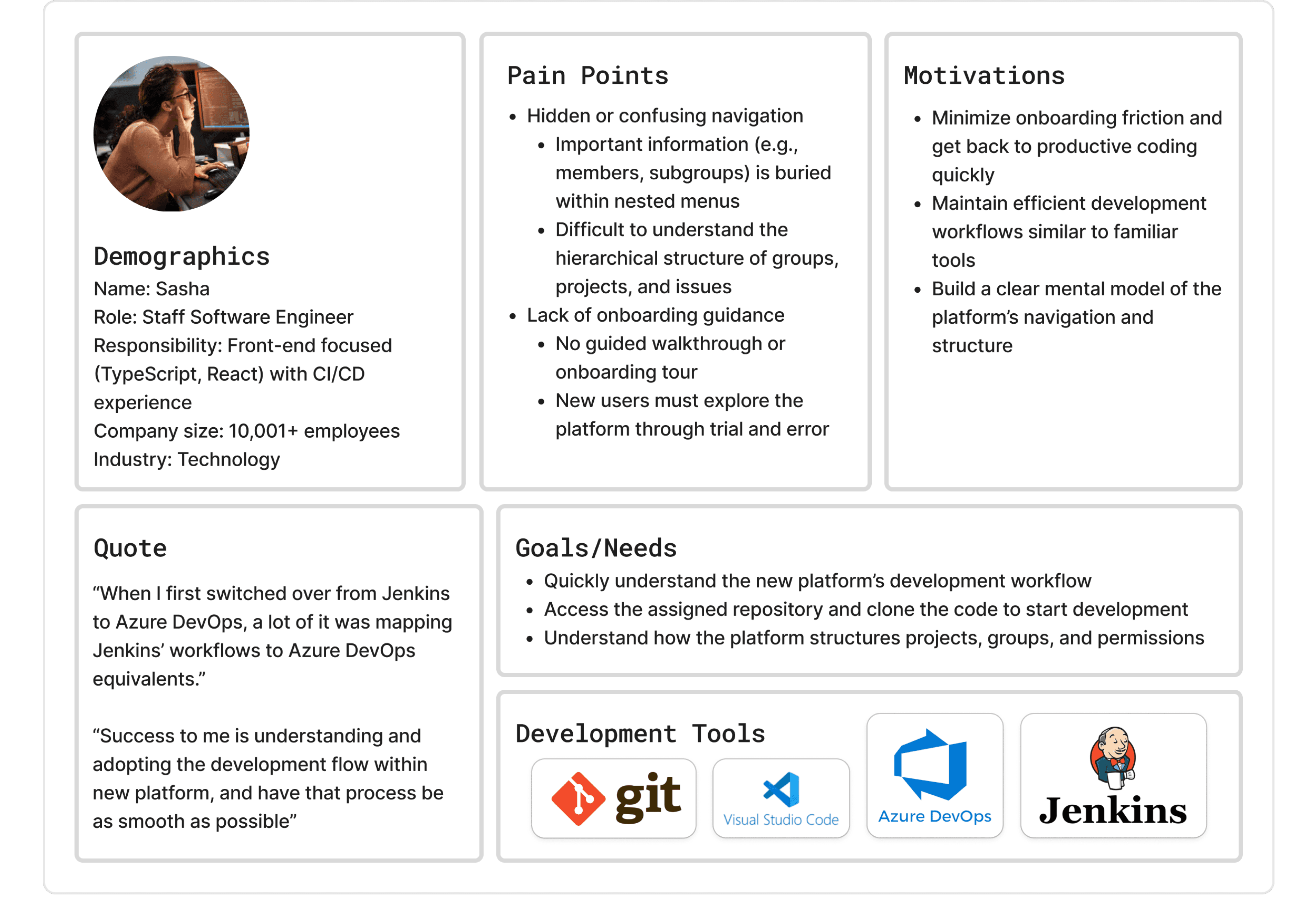
Creating user persona based on interview data
--
Design concepts
Created 2 initial design concepts for testing
Problem Statement
I am a software developer who has recently been invited to an organization’s GitLab instance and need to quickly get up to speed on my team’s project and begin completing tasks, but confusion around the platform’s hierarchical structure makes it difficult to understand where I am and how different levels relate, reducing my efficiency and confidence.
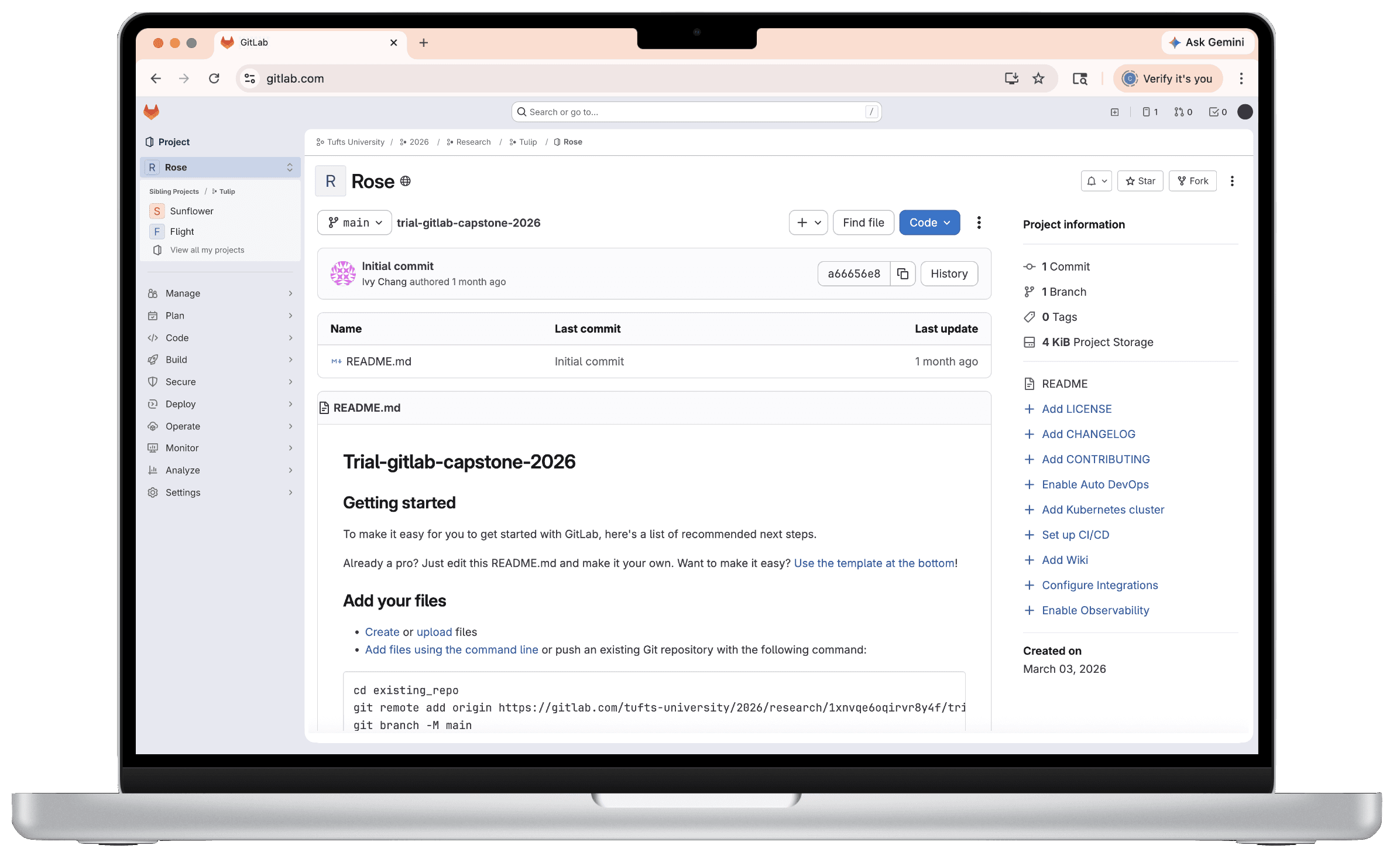
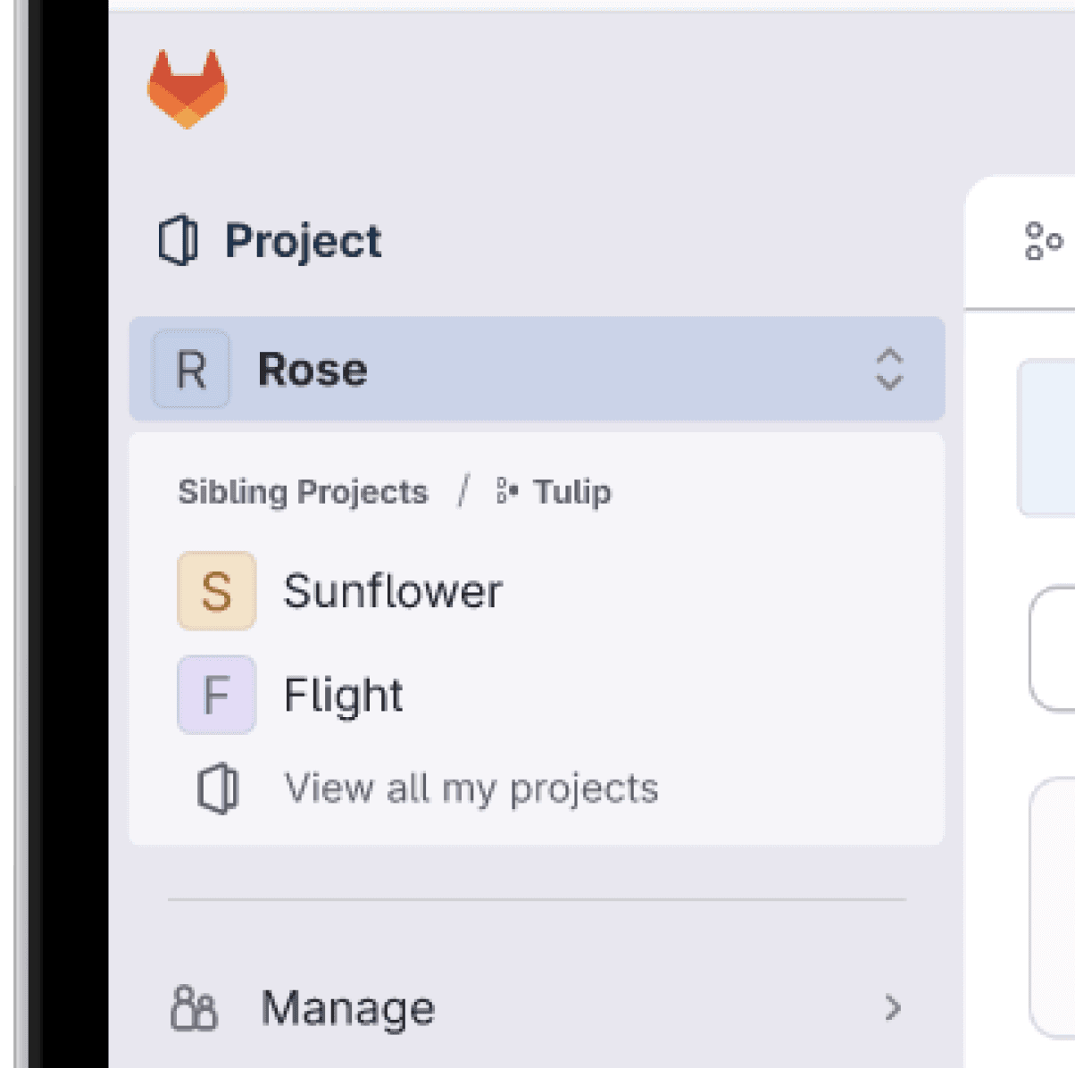
Concept #1: Sidebar dropdown
The page title has a new icon on the right that indicates interactability: on click, sibling projects or groups are revealed in a dropdown. This concept solves the problem statement by providing hierarchical clarity through explicit labeling. The use of explicit titles within the dropdown, such as "Sibling Project" or "Sibling Group," significantly increases user confidence in understanding where they are and what they are looking at. Users learn how different levels relate to one another by interaction.
Concept #2: Breadcrumb dropdown
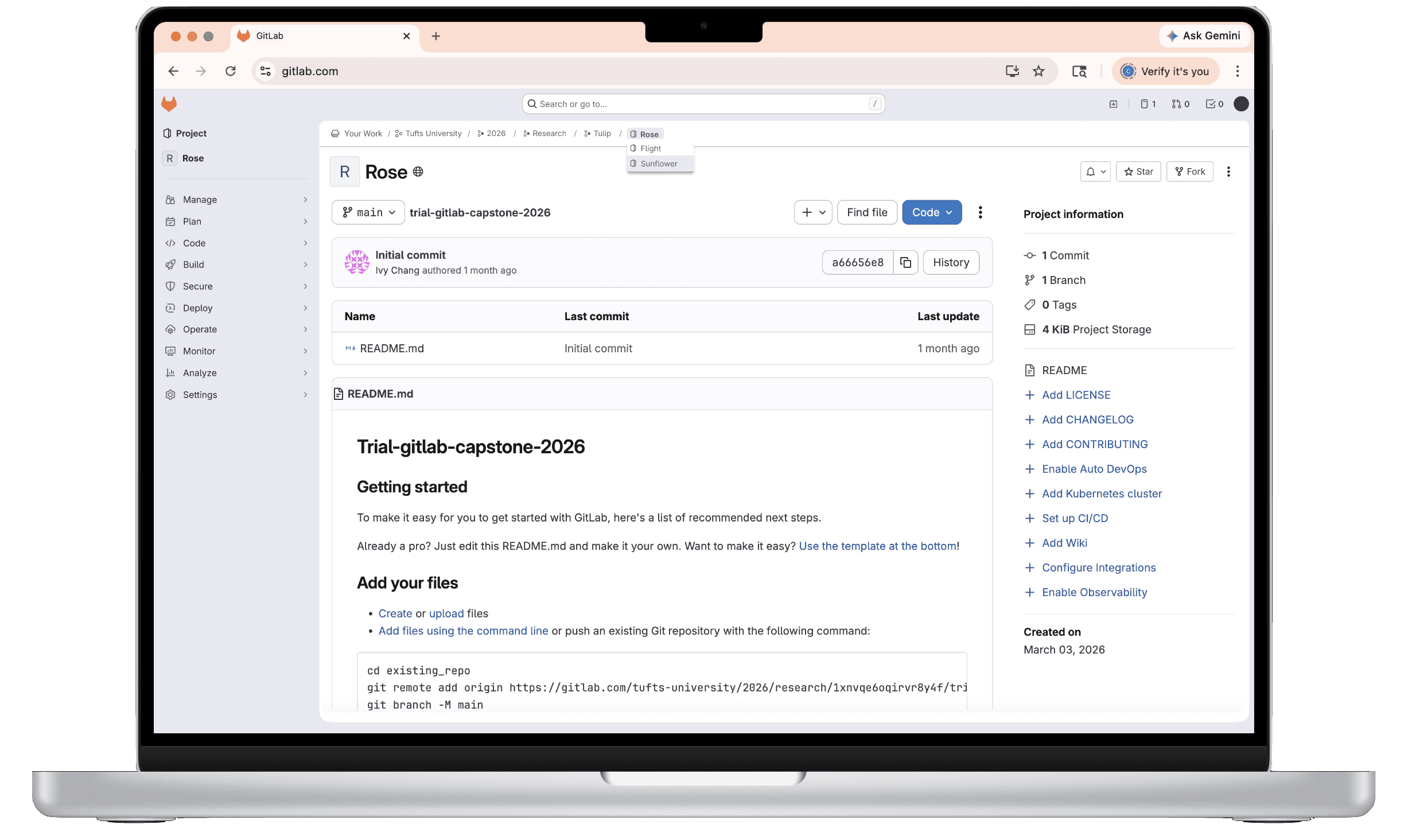
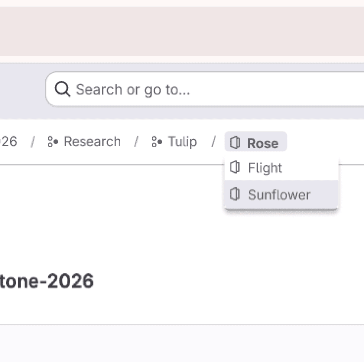
When users hover over a breadcrumb, the sibling projects or groups appear in a dropdown. On click, they can navigate to the page. This concept solves the problem statement by providing a tool for reorientation and multi-level navigation. It allows users to understand and switch between multiple levels of the hierarchy simultaneously, and clearly indicates the relationships across different levels.
--
ITERATIONS & TESTING
Concept testing & usability testing
Usability Testing Round #1
Research Questions & Goals
Do users find the navigation bar changes (breadcrumb and sidebar) familiar and aligned with their expectations?
Does one concept increase confidence in users when navigating than the other?
Does one concept more effectively help users understand information hierarchy than the other
Main Findings
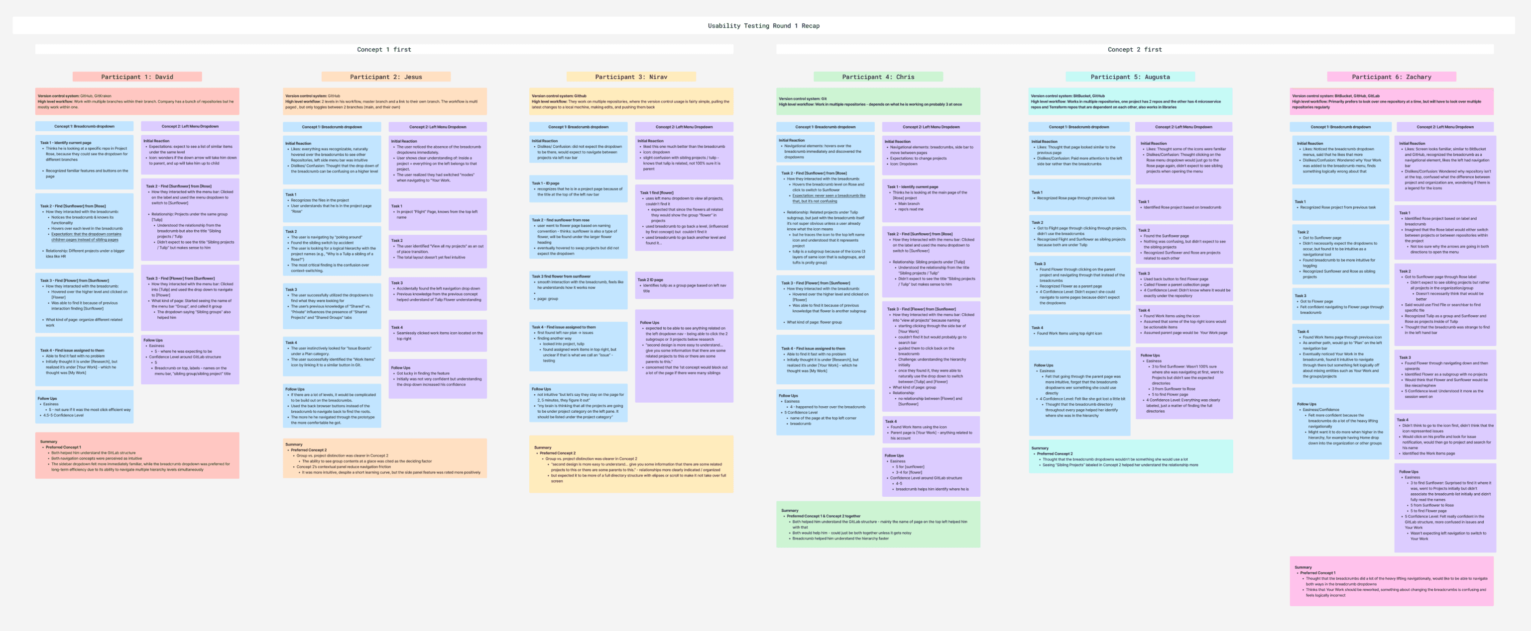
3/6 Preferred Concept #2
✅ Explicit labeling within the dropdown like “Sibling Project” titles significantly increased user confidence
✅ The addition of icons across the page also contributed to user confidence
✅ A cleaner interface to look at
❌ UI is unconventional and that they have never seen a dropdown in the sidebar that offers this functionality. Hence, there is a learning curve.
2/6 Preferred Concept #1
✅ Liked that they could switch between multiple levels of the hierarchy at once
❌ Discoverability is lower when participants didn’t expect the dropdown
❌ Some participants also expected a different logic for both the dropdown content and the anchor
1/6 Preferred Combined
✅ Users can learn about the parent/child relationship in multiple ways
❌ Could make the interface feel overwhelming and noisy
Iterations
Expectation Mismatch
Participant 5: “I thought [clicking on the project label] would go to just this page again.ˮ

UI Confusion
Participant 6: ““I would expect it to just be down when it's collapsed and up when it's not collapsed. And it's a little confusing as to why there's up and downˮˮ

Conflicting Logic
Participant 6: “This is odd to find. I feel like this is odd to find under a dropdown menu in a sidebar, to see a breadcrumb under here.ˮ

Edge Case
Participant 3: “Because if we have, let's say, like 20 or 25 projects, it's gonna blow up your screenˮ

Usability Testing Round #2
Methodology
Usability testing between our design & original GitLab interface
Task Success Rate, Number of Use Errors, SEQ scores
Goals
Test the addition of icons across interface
User confidence when navigating
Effectiveness in understanding information hierarchy
We received many positive outcomes
Efficiency
“It gave you another way to navigate.ˮ
“I feel like it was less clicks… I just clicked on [the side swap] and it was right there rather than having to go [through the
breadcrumb]ˮ
User Expectation
“This tooltip tells me what it's supposed to be able to do. So that
was pretty clear.ˮ
“Navigation solely through the breadcrumbs didn't feel very
natural to me.ˮ
“Yeah, so I would assume that they are all either, you know, subprojects or subfeatures of the Tapestry project ... So the sibling
projects makes sense to me.ˮ
Improvement over original
(With the original interface) “The breadcrumb don’t really explain what each level represent in the hierarchyˮ
(With our design concept) “The iconography here of page versus subgroup is much more clearly identifiableˮ
Without [the icons], you know you're in the hierarchy
structure, but you don't really know what each [page] isˮ
Quantitative Measurements

--
Final Design
High-fidelity Prototype
Mock Grooming Session
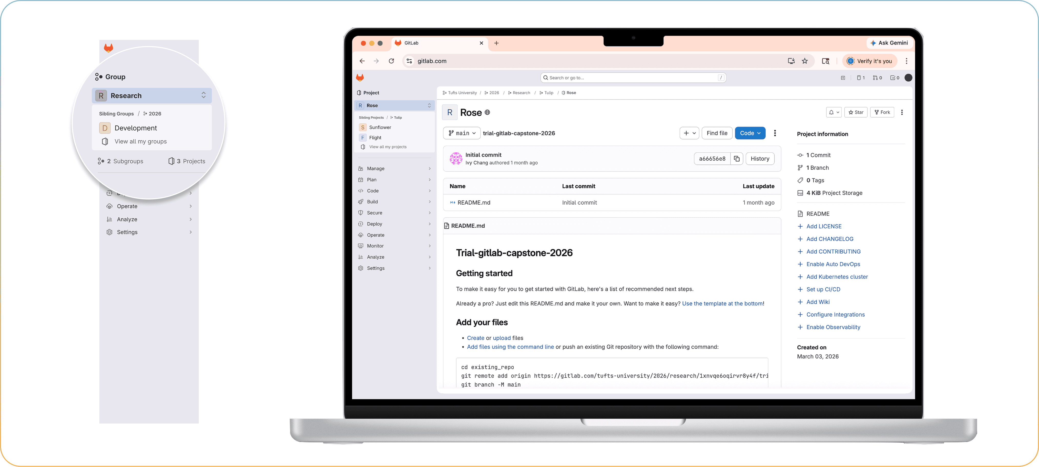
We handed-off our Figma prototype to GitLab engineers for technical feedback. Thus we arrived at this design solution: a sibling navigator that clearly indicates the relationship between projects and groups to a user. A dropdown is activated on click to allow sibling navigation in the sidebar, where users can scroll or search for the sibling item. Tooltip appears on hover to explain the functionality of the dropdown. In addition, project and group icons are added to indicate hierarchical information to users in the breadcrumb and heading.
Next Steps
Iterations
Testing the scoped search bar with larger number of dropdown items
Exploring different sorting and organization methods
Expansion of functionality
File-tree hierarchy design
Determining the optimal number of visible hierarchy levels to balance clarity with simplicity
View Slide deck
Check out more about our project from our slides!





© Ivy Chang 2026
Thanks for stopping by! Let’s stay connected